%20(1).png?height=120&name=Aiola%20Logo_Circle_white%20(1)%20(1).png)
The Filter List feature in aiOla enables users to efficiently sort through their list of Execution Items based on the reported values for specific items. By utilizing this feature, users can easily locate the information they need.
The Filter List feature presents a list of possible Value Titles alongside their corresponding Value Inputs. Users can select from these Possible Values when utilizing the Filter feature, simplifying the process of finding specific items.

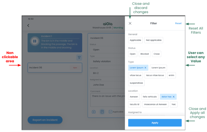
Note: the above example uses Portrait view. See landscape adaptive UI at the bottom of this page
Filtering Criteria
Empty State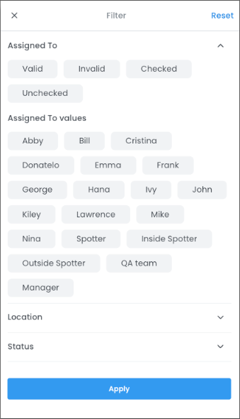
- Value Types: Any value type can be used for filtering based on whether the event has a value or is empty. This includes text, numbers, dates, and other data types.
- Event Types: All event types can be filtered based on their empty state. For example, you can filter events in a list to show only those that have no values entered.
Validity
- Value Types: This applies to value types that can be validated, such as text, numbers, and dates. These are validated according to the defined validation rules.
- Event Types: Validity can be applied to all event types where validation rules are defined. For example, if a text field requires a minimum number of characters, you can filter events based on whether the entered text meets this requirement.
Event Values
- Value Types: Any value type that can be filtered based on specific selected values. This includes dropdown lists, checkboxes, and other selectable options.
- Event Types: All event types that have specific selectable values. For example, if an event type is a dropdown list of options, you can filter events based on which options have been selected.
These filtering criteria provide a flexible way to view and analyze data based on various conditions and requirements.
|
Value Type |
Available for filter |
Additional info |
|---|---|---|
|
Comment Value |
Empty State / Validity |
no ability to filter by Event Values |
|
Select From List |
Empty State / Validity / Event Value |
|
|
Select a Button |
Empty State / Validity / Event Value |
|
|
Multi Select (Not Released Yet) |
Empty State / Validity / Event Value |
|
|
Numeric Value |
Empty State / Validity |
no ability to filter by Event Values |
|
Date Value (Not Released Yet) |
Empty State / Validity / Event Value |
|
|
Picture |
No |
|
|
Applicable / Not Applicable |
Event Value |
Selecting all items that are “Applicable” will present all items that are “Not - Not Applicable” |
Filter Options
Buttons
- Open: This button opens the filter options.

- Close and discard all changes: This button closes the filter options and discards any changes made.
- Close and save all changes: This button closes the filter options and saves any changes made.
- Reset all Previous Filters: This button resets all filters to their default state.
No Value Selected in Filter for a Specific Value Type
- If no value is selected for a specific value type, all items with all values from that specific value type will be presented without any filtering.
Selecting Multiple Values:
- If the user selects several values from the same value type, the logical relation between the values in the filtering process will be "OR." This means that items matching any of the selected values will be displayed.
- If the user selects several values from different value types, the logical relation between the values in the filtering process will be "AND." This means that items must match all selected values from different value types to be displayed.
This approach allows users to filter their data effectively based on their specific needs, whether they are selecting multiple values from the same value type or from different value types.
Landscape Layout
In the landscape UI layout, the filter feature opens from the right side of the screen, providing partial visibility of the background content. However, the darkened background behind the filter feature is not clickable. Users must close the filter feature to interact with any functionality in this area.
This design ensures users can conveniently access the filter feature while maintaining visibility of the background content.